

No matter what expert analysts forecast, you should do your own technical analysis of the cryptocurrency market and this is where the trading chart patterns come in handy.
According to Bakkt Holdings projections, the cryptomarket could reach $3 trillion by 2025. On the same note, CryptoPredictions.com predicts that for the coin with the largest market cap, Bitcoin, to hit the $100,000 mark by the end of 2021.
Summary
Crypto patterns
Essentially, the market is composed of people of all walks of life. We have rookie traders, professionals and groups.
The traders depict behaviour patterns as they interact with each other creating a collective behaviour pattern. While numerous life aspects do not change, people tend to portray the same emotions, such as fear and greed, when they experience a similar situation.
Traders’ reaction causes rise and fall in crypto prices as cryptocurrency supply and demand change. The price oscillation at certain levels forms patterns that help traders predict the likely price movement. Observing these patterns could help you predict the traders’ next collective action.
A cryptocurrency chart pattern can be categorised as continuation or reversal patterns. Continuation patterns can either be bullish or bearish. The same case applies to reversal patterns. This article will provide a cheat sheet of excellent chart patterns for crypto market technical analysis. Let’s start with reversal patterns.
Reversal patterns
As the name suggests, these patterns signify a change in the market. This means the current trend is coming to an end. To put this into perspective, when a reversal pattern occurs during an uptrend, it means the market is shifting to a downtrend. If the patterns occur in a downtrend, it signifies optimism among traders. Therefore the downtrend could turn around, and the price will start rising. As mentioned, reversal patterns can either be bear or bullish.
Continuation Patterns
If you want to ride the current trend, continuation patterns will prove helpful; The patterns usually involve a consolidation phase before the trend resumes. Therefore, you can open a new trade or add trades to existing positions. In fact, the price tends to accelerate after the pause.
Now let’s explore some of the common chart patterns you can use to trade cryptocurrencies successfully.
3 Main reversal crypto patterns
Head and Shoulders and Inverse Head and Shoulders
Head and shoulders sound like some PE lesson in kindergarten. However, the head and shoulder pattern is quite a useful pattern for cryptocurrency trading. It usually occurs at the top of an uptrend and predicts the market is shifting to a downtrend.
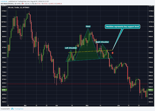
Here is how it is formed.
The market rises and hits a peak, and then pullbacks forming the left shoulder. The markets pick up after forming a new low and rise surpassing the previous high. The new higher high forms the head. The price then declines to another low. This time the price rises to a lower high which becomes the right shoulder.
The price lows (troughs) on the left and right are almost at the same level. The complete pattern forms after breaking below the neckline. You are probably wondering what a neckline is. It is the support level connecting the low of the left and the right shoulder.
The inverted head and shoulder pattern are pretty much similar to the head and shoulder pattern, only that it forms after a downtrend indicating a bearish to bullish trend reversal.
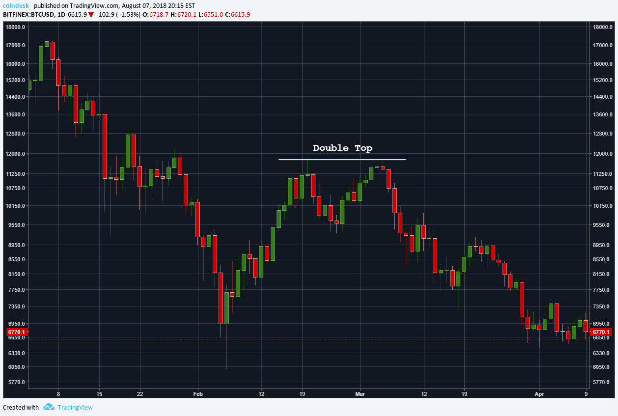
Double top and double bottom
The double top chart pattern is pretty much straightforward and easy to identify. Essentially, it occurs at the end of an uptrend. The price hits a resistance level after reaching a new high. The price then falls as timid buyers close their position. This creates a minor pullback. However, buyers push the price high once more, but the price fails to break the resistance and falls back. The chart pattern is complete when the price breaks below the pullback level signalling the end of the uptrend.
The double bottom is pretty much the opposite of the double top. It occurs after a downtrend indicating a likely price reveal. Therefore traders should be ready to enter long positions.
Here is how it forms.
The price falls to a new low, hitting a support zone. Some traders exit because they fear the trend is over. The price increases as traders close short positions. However, the remaining sellers try to push the price low, but the buyers prevail and push the price upwards, breaking the pullback high. The pattern signifies the end of the downtrend.
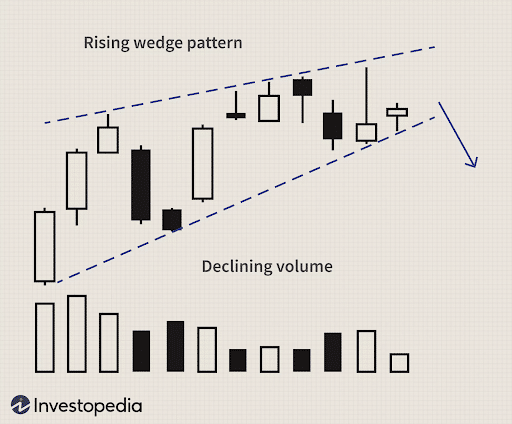
Rising wedge and falling wedge
Wedges is yet another reversal of the price pattern. The rising wedge forms when the price makes higher highs and higher lows which shrink towards the edge. The highs and the lows should be in line and easy to connect with the trendline. You will notice the lower trendline rises at a steeper angle than the upper trendline. A rising edge indicates an uptrend is losing momentum and signals an upcoming downtrend.
The falling edge is a mirror of the rising wedge. It slants downward as the market forms lower lows and lower highs. The trendline connecting the high and lows slant downwards and connect at the end. Eventually, the market fails to make new lows suggesting the end of the downtrend and the beginning of the uptrend.
3 Top Continuation Chart Patterns
Continuation patterns signal the trend will continue in the existing market direction.
Ascending and Descending Triangle
A triangle pattern in a chart signifies a price continuation. Ascending triangles form during a consolidation phase. Here is the explanation.
The price reaches a high but can’t break the resistance. Instead, the price keeps retesting the barrier. In this case, most traders think the uptrend is over. Eventually, the buyers gain more control of the market resulting in a breakout followed by a strong uptrend.
Descending triangles similar to ascending triangles. Essentially, the sellers push the price downwards but buyers keep trying to reverse the trend. When the support can’t hold more pressure, the price breaks below the support as the buyers get increasingly exhausted.
Bullish and Bearish Rectangle
We have mentioned triangles. Rectangle patterns can also help you significantly. It goes without saying you should have some basic knowledge of shapes. Well, not necessarily, but it would help.
The good thing is that rectangles are easy to recognize. Ideally, the price moves sideways during an uptrend. Since the buyers and sellers have equal strength, the price moves in a tight range bounded by a resistance level and a support level at the bottom. The buyers then regain market control and push the price upwards.
Bearish triangles occur during a downtrend. The price consolidates as buyers and sellers compete for market control. Eventually, the sellers prevail and push the price downwards.
Flag Chart Pattern
Flags are fairly simple but extremely powder patterns. Essentially they provide explosive moves. Here is how the bullish flag chart pattern forms.
The price makes a massive advance that surpasses a resistance level. This advance is known as a flagpole. After this movement, the market consolidates forming a flag pattern consisting of two trend lines slanting downwards. The pattern completes when the price increases and breaks above the flag.
The bearish flag chart pattern is similar to the bullish flag pattern, with the price pointing in the opposite direction. The flagpole is the huge price drop that forms after breaking a previous support level. The price then consolidates forming a flag like a pattern. The flag is encompassed with two parallel trend lines that are slightly pointed upward. The small retracement is followed by a downside price break out from the flag. This market movement completes the pattern.
Pennant chart pattern
Pennants resemble flags. In fact, some traders can’t differentiate the two. Don’t worry if you fall into the category. We will help you.
Bullish pennant chart pattern forms when the traders show less intensive effort to turn around the trend during the consolidation phase. In fact, the pattern resembles a triangular flag. This shows that the buyers are way stronger than the sellers.
Similarly, in a bearish pennant chart pattern, the price movement in a sideways narrowing range forming a triangular flag-like pattern. The price consolidates for a brief moment before breaking downwards and resuming the trend.
Which is the best pattern?
Well, there is no holy grail in cryptocurrency trading. Most chart patterns provide great entry signals. Similarly, they all show dramatic movement in some cases.
Nevertheless, if you are looking for an explosive move, consider the flag and pennant chart pattern. Why? The pole (sharp price proliferation) provide great profits. Traders exit after taking profits resulting in a small retracement (pennant or flag). Traders who missed the chance then jump into the trade resulting in another expulsion. Usually, the flag occurs during news events when traders are more active.
Conclusion Note
While patterns are not 100% accurate, they are very helpful when performing technical analysis elements. They simply signal and ending market trend or trend resumption after a brief consolidation. Therefore prudent traders should be on high alert when they notice the chart patterns. Additionally, the chart patterns work best when combining with other analysis tools. In nutshell, perfecting your mastery of chart patterns can rake you good profits.