

The so-called Bitcoin Rainbow Chart, a logarithmic chart of the evolution of the bitcoin (BTC) price using coloured bands, has been published on blockchaincenter.net.
This chart was created by Über Holger, CEO of Holger and responsible for the content of the website, using a logarithmic regression introduced by the Bitcointalk user trolololo in 2014, with which the coloured bands were created.
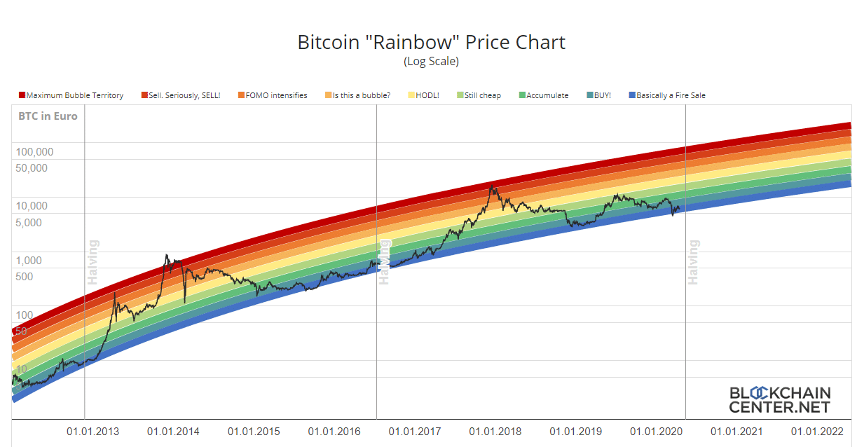
However, Holger admits that these bands are completely arbitrary and without any scientific basis, so they are only correct until one day maybe they won’t be anymore.
However, the chart allows you to observe price movements over the long term ignoring the inevitable disturbances generated by daily volatility, and getting an idea of what were the best times to buy or sell BTC in the past.
Holger states that the Rainbow Chart is not investment advice, because past performance is not indicative for future evolution, but divides the bitcoin price into eight coloured bands: bubble, sell, FOMO, bubble formation, HODL, still cheap, accumulate, buy and discounts.
The names of these bands are evidently humorous, but behind the apparently superficial and amusing form of this graph lies some truth.
In fact, the curve of the eight bands seems too perfect not to make sense. That is, until now these bands really seem to have given interesting suggestions on how to behave when buying or selling BTC, although as Holger says this is absolutely not enough to know whether this will be the case in the future.
First of all, both post-halving bubbles ended in the “bubble” band, or beyond, while the three minimum pre-halving levels have always been included in the “discounts” band.
However, some doubts may arise from the August 2013 peak, with the price at $180 being in the “sell” band. It’s true that the price then fell below $60 in June, but by November it was already back above $180.
Other doubts may come during the peak of June 2019, when the price rose to $13,000: in the chart this corresponds only to the HODL range, while at the end of the year the price had more than halved.
So even analyzing the past data, these eight bands do not give precise indications when to buy or when to sell, except when the price curve reached the extreme bands.
The curious thing is that, according to this chart, the price of BTC would currently be in the “discounts” band, very similar to where it was just before the two previous halvings.